U.S. Immigration and Customs Enforcement (ICE) may be in favor of the federal government, but with everyone else, they have fallen down the list of people invited for Christmas.
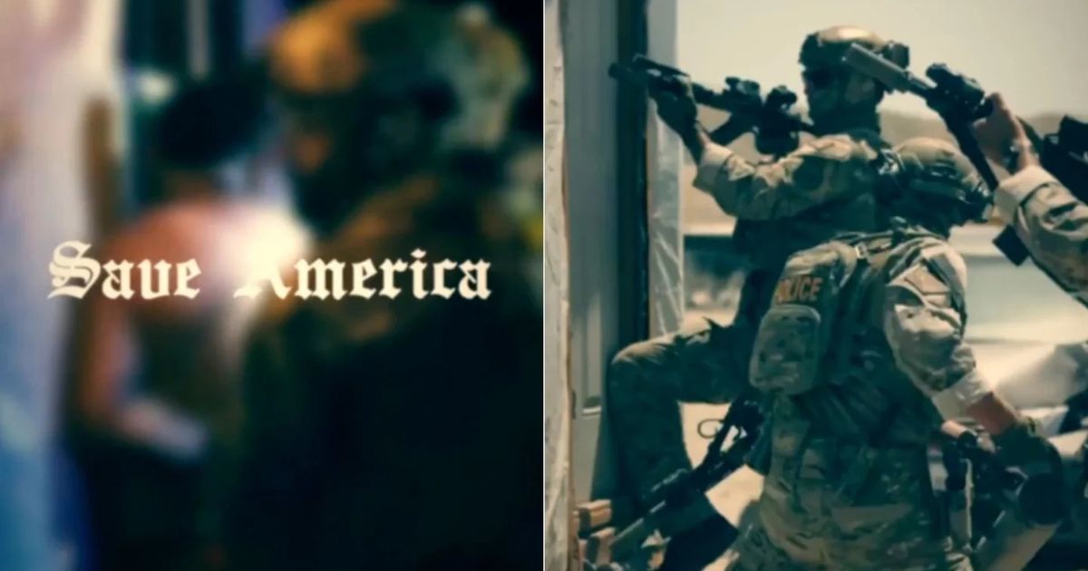
ICE is again facing intense criticism. However, this time it is not for their deportation or arrest tactics. The backlash came after ICE released a recruitment video that features an image of Nazi propaganda. The video features a typeface that has been strongly associated with Nazi-era propaganda.
https://youtube.com/shorts/6TcO_J-VNM4?si=pE7DhkcEAN3qKtAH
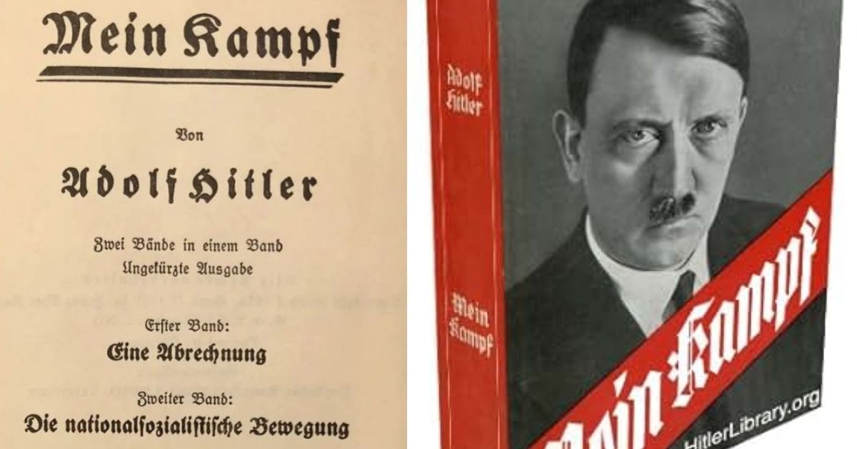
Online users and viewers quickly noticed that the video’s title text was written in a blackletter style. This font closely resembles the Fraktur font that was used in Adolf Hitler’s Mein Kampf and was featured in several other materials promoting Nazi ideology.
The video was intended to encourage new applicants to join ICE. It was posted on social media and official platforms earlier this week. The messaging of the video in itself is very provocative; however, this time, public attention has shifted to the font choice.
The video is not only trying to send a message about law enforcement and national security, but it is also believed to be sending negative optics. The design decision has been described as tone-deaf and historically loaded.
I missed this yesterday but the latest video ad to join ICE uses a font similar to the kind of font to the one used by Nazis, Fraktur. 1/ pic.twitter.com/FHsFKQb27C
— Grant Hermes (@GrantHermes) August 11, 2025
Blackletter typefaces, including Fraktur, were once a staple in German printing. However, by the 1930s, the Nazis had adopted the style completely. They promoted it as a symbol of German tradition and cultural heritage. The font was featured prominently in official documents, propaganda posters, and Hitler’s own writings.
However, in 1941, the Nazi regime abruptly abandoned the typeface. They labelled it “Judenlettern” (Jewish letters) and replaced it with more modern Roman-style fonts. Though they tried hard to distance themselves from their earlier notion, the association between blackletter and Nazi propaganda has persisted.
Today, blackletter fonts are often used in conversations ranging from heavy metal album covers to extremist group insignia. These contexts reinforce its perception as a symbol of authoritarianism or aggression.
Historians, typographers, and social media users have also weighed in on the controversy. Nate Ledbetter is a Princeton history professor, and he has noted, “Using the Nazi-esque font is bad, but the imagery in the video is also troubling. Fonts carry cultural memory, and this one is loaded with it.”
Others have pointed out that, although blackletter was not used exclusively by Nazis nor officially adopted by the ‘movement’, its association with the authoritarian governments and the ideologies propagated by them is too far in the minds of the people. The current US government, as I said, is under fire for its headline immigration policies, and people of color must stay as far away as possible.
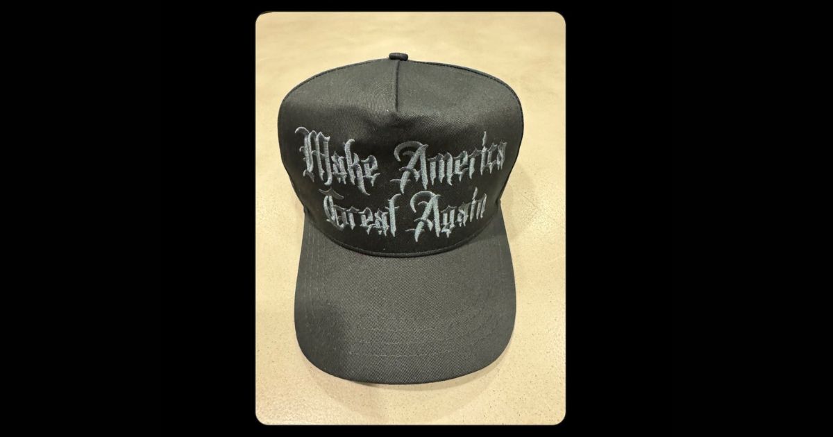
The backlash over ICE’s font choice shows the truth in design and communication. A seemingly small aesthetic decision can have significant consequences, especially on the messaging. Fonts, colors, and symbols carry cultural baggage. One can not just dissociate references and history from something so profound.
ICE is often criticized for its handling of immigration raids, deportations, and detention practices. In such a situation, the decision to use a historically charged typeface is definitely not a smart one and should not have been taken.
Critics argue that such oversights contribute to the perception of insensitivity or even hostility toward vulnerable communities.